
Turning Financial Numbers into Information You Can Actually Use
Most business owners are not short on numbers. They are short on the time it takes to make sense of them. The reports pile up, the spreadsheets grow, and somewhere in all of it is the answer to a simple question: is the business headed in the right direction, and what should you do about it?
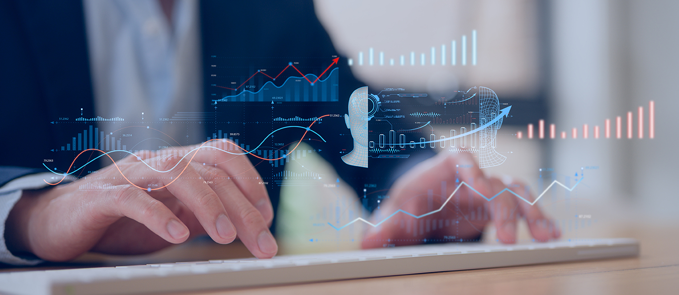
That is the real job of financial data visualization. Instead of staring at rows of figures, you see your business as a clear picture, where the trends jump out and the next move becomes obvious. Pair that picture with the right guidance, and your numbers stop being a chore and start pointing you toward growth.
In this article, we cover what that looks like in practice, and why it matters for the way you plan the future.
Why Raw Numbers Hide the Answer
A spreadsheet can hold everything about your business and still tell you almost nothing at a glance. The figure that matters is buried, and the trend that should worry you looks the same as all the other ones. By the time anyone connects the dots, the moment to act may have passed.
Good visualization fixes that. An effective chart shows you in seconds what a page of numbers hides for an hour: which way a trend is moving, where you are gaining, and where something is slipping before it becomes a real problem.
What a Financial Analytics Dashboard Really Does
A financial analytics dashboard is simply one place where the numbers that matter most are shown clearly and kept current. Done well, it does not bury you in charts. It puts the few measures that actually drive your business front and center, so you and your team are always working from the same view.
The point is not to give you more information. It is to leave you with less guesswork. A strong dashboard answers the questions you care about, like how this month compares to last, where you stand against businesses like yours, and which direction things are trending, without making you dig.
From Looking Back to Looking Ahead
Traditional financial reports tell you what already happened. That is useful, but it is only half the story. The more valuable question is what is likely to happen next, and what you should do to be ready.
This is where modern analytics earns its keep. By learning from your history and your current trends, it can point to where you are headed, not just where you have been. A clear visual of that forecast turns a wall of data into a plan you can actually follow.
Why the Human Side Still Matters
A good picture of your numbers is a great start, but a chart cannot tell you what to do with it. It does not know your customers, your market, or the goals you are working toward the way you and a trusted advisor do.
That is why the best results come from pairing clear visualization with experienced people who can explain what you are looking at and recommend the specific steps most likely to help. The technology handles the heavy lifting on the numbers. The judgment about what to do next is a conversation.
Where Zintoro Fits In
Zintoro was built to help you track, make sense of, and actually use your company’s analytics. We take the data your business already produces and turn it into a clear, accurate read on where you stand and where you are headed. You see how you compare to similar companies, which customers may be at risk, and exactly where to focus to reach your revenue goals.
The best part is that you are never left to read the charts alone. On a regular call, our team walks you through the numbers, explains what they mean, and recommends specific changes, pairing the speed of AI with the judgment of experienced advisors. The result is simple: less time buried in spreadsheets, and a confident plan for growth.
Want to see your business more clearly? Contact our team today.
Frequently Asked Questions
Financial data visualization is the practice of turning your numbers into clear charts and visuals so trends and problems are easy to spot. Instead of reading rows in a spreadsheet, you see your business at a glance and can act on it faster.
A good financial analytics dashboard focuses on the few measures that actually drive your business and keeps them current. Rather than overwhelming you with charts, it answers the questions you care about, like how you are trending and how you compare to similar companies, without making you dig for the answer.
Financial reporting Power BI tools are a popular way to build dashboards, but a tool on its own only shows what you set it up to show. The value comes from knowing which measures matter and what the trends mean, which is why most businesses benefit from pairing a platform with people who can interpret the results.
On its own, a visual mostly shows what happened. The bigger payoff comes from pairing a clear picture of your numbers with forecasting and expert guidance, so you also understand what is likely to happen next and which specific changes are worth making.
Zintoro is an AI-powered platform that turns the data your business already produces into a clear read on where you stand and where you are headed, then walks you through it. You see how you compare to other companies and exactly where to focus, with our team explaining what the numbers mean on a regular call. Contact our team to get started.